From everyday meals to Valentine’s Day: two in-store strategies connecting ritual and impulse
February in Tesco hypermarkets belonged to the Coca-Cola brand through two distinctive in-store executions. While the Coca-Cola Zero Zero shop-in-shop focused on launching a new product and supporting the long-term Coke & Meal platform, the Valentine’s concept...
Felix as an experience on the sales floor: when emotions decide the purchase
Shop-in-shop Felix was created with a clear goal: to bring the brand’s key benefit to the sales floor – the fact that Felix is the number one choice that shoppers (and their cats) in the Slovak market have selected as their first option. This very insight became the...
Eleven awards for DAGO in the prestigious POPAI Awards 2025
A successful run across categories and recognition from an expert jury. DAGO is taking home eleven awards from this year’s POPAI Awards 2025, confirming its high standard in instore communication, its emphasis on precise craftsmanship, and its ability to create...
Introducing Endcap 3.0: When cardboard can take on the role of a permanent display
Realization of a combined display for the brands Jack Daniel’s & Diplomático under the banner of Brown-Forman Czechia represents a new trend in the field of shelf ends and endcaps. Compared to traditional permanent solutions costing tens of thousands of crowns, it...
Monster shop-in-shop with a Formula car: marketing at full throttle
Značka Monster has long positioned itself as a prominent player in the lifestyle and motorsport world. The collaboration with the McLaren team, which includes competitions for F1 race tickets or experiences with the McLaren team, is an example of how a global sports...
DAGO, together with the Rajec brand, transformed the sales area into an oasis of calm for mothers and their babies.
The beginning of summer in selected modern trade stores was marked by tranquility and maternal care. The Rajec baby water brand introduced an engaging shop-in-shop concept as part of its marketing campaign “Mother Nature Wishes Sweet Dreams”. The in-store solution was...
Zlatý Bažant in a New Light: Two powerful in-store campaigns for redesign and summer refreshment on the Slovak market
Slovak brand Zlatý Bažant has taken a bold step after 24 long years – it has changed the shape of its iconic bottle and at the same time said goodbye to the golden foil on the neck. The new design is cleaner, more modern, and clearly targets a younger generation of...
We Celebrate Success at Shop! Paris Awards 2025: Two Medals for Czech POP Design
The international Shop! Paris Awards competition is an annual celebration of in-store communication and design and is considered the most prestigious European contest for POS projects. Awards are presented by a professional jury composed of retail professionals,...
Hockey-themed POP media set from Fernet Stock and Republica captivates shoppers and sports fans alike
As part of the “What team are you drinking for?” campaign, STOCK Plzeň-Božkov relied on a strong mix of Czech national pride, the emotions connected to the Ice Hockey World Championship, and the iconic brands Božkov Republica and Fernet Stock. The key element of the...
DAGO Triumphs with L’Oréal Virtual Mirror Project on the International Stage
The L’Oréal Virtual Mirror project, which dominated the POPAI CE Awards in Prague in November 2024, is celebrating another major success. It has won a gold award at the prestigious international Shop! Global Awards 2025, specifically in the Beauty & Cosmetics –...
EVALUATION OF PHARMACIES FOR MARKETING & MEDIA

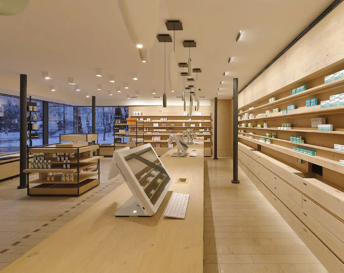
Schubert Apotheke
Pullach, Germany
The modern interior made of a light wood with thoughtful lighting and a warm shade of tiles creates a feeling of coziness despite its austerity. The emphasis on every detail then “tells” the customer that he is in good hands here. The design lights above the tare attract attention. The architects from the award-winning Raumkontor studio in Düsseldorf are behind the design.
The reconstruction took place in 2019.
Grade: 2
At first glance, the light shades of wood in combination with metal and grey accessories do not evoke a feeling of a “pharmacy environment”, which was probably also one of the designers’ goals. The reason was probably the offer to avoid the deep-rooted discomfort we feel when we have to go to the pharmacy (usually due to some illness or pain). The environment, therefore, has a very calm and clean effect on customers. At first glance, I would rather see it in a store with organic natural cosmetics than a pharmacy with pharmaceutical goods. There is no education, action goods, or other elements, crucial especially for older generations. So I would rather see targeting younger people. In my opinion, technically and design-wise, it has been processed very nicely and precisely, but I’m not sure if it is a good solution for the pharmacy.
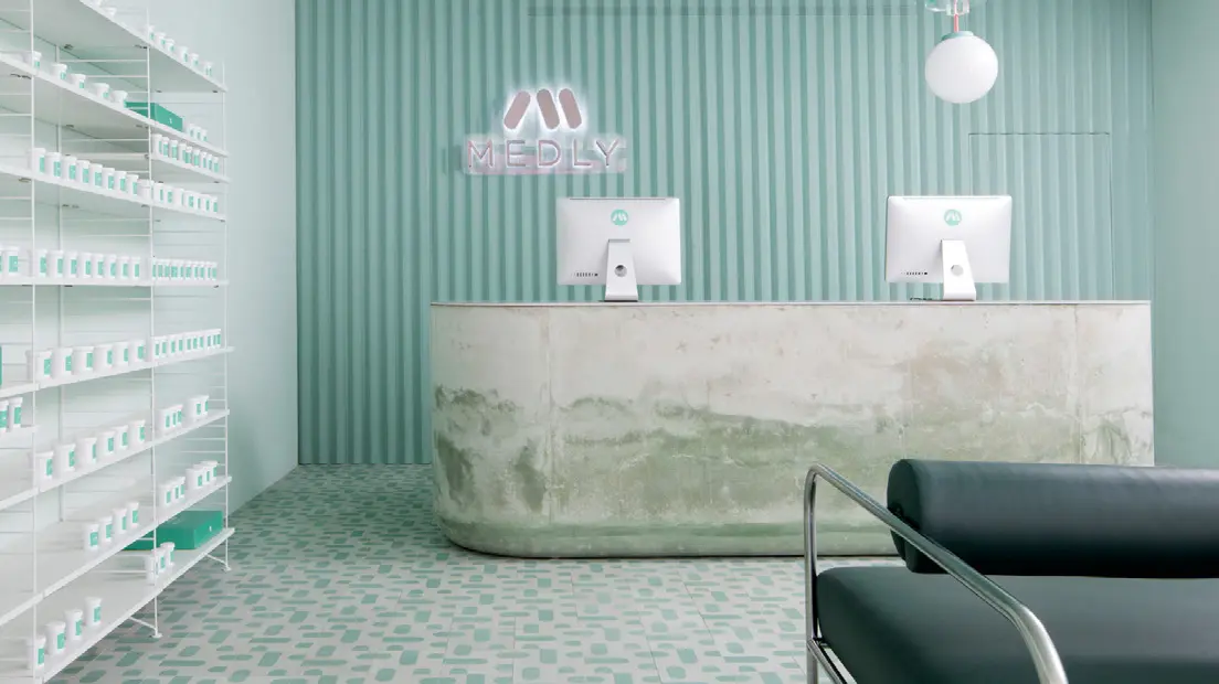
Medly Pharmacy
Brooklyn, USA
Medly Pharmacy is a digital pharmacy that delivers over-the-counter and prescription drugs on the same day that the customer orders them. The company, owned by father and son Marg and Sahaj Patel, rebuilt a B&M pharmacy in 2018, which also serves as a distribution point for orders. The new look, designed by Sergio Mannino, reflects the need to connect the online and offline worlds.
Grade: 5
The vision of connecting the online and offline world is the right direction, no one doubts that. The advantage of this concept that customers receive their ordered goods the same day is great. Unfortunately, looking at the design and construction of the pharmacy and dispensary space gives me shivers. The cold to chilly design reminds the environment of a hospital or some medical institution, and I think that, unfortunately, this is a place where no one wants to go. The stone shop counter, which in its lower part looks like being after a flood in my opinion is not a suitable piece of design. The same goes for the minimalist green seats. Unfortunately, I think that this is not a well-chosen store design. At the pharmacy, the goal should be that when people have to go there, the vendor should try to create a better mood through the atmosphere.
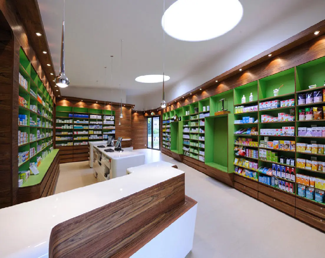
Pharmacy in Zwickau
Germany
Heinrich Braun Hospital got a new pharmacy on the premises several years ago. The exterior, which complements the architecture of the surroundings with its sharp shapes, contrasts the interior design. The bent dark wood (Guibourtia ehie) is complemented by white smooth surfaces and illuminated shelves in the color of green apple. Daylight is brought in by large ceiling skylights. The design is the work of the Leipzig Atelier st studio.
Grade: 1
I think this is a well-designed pharmacy. Whether from outside or inside. At first glance, the exterior resembles a small modern church and it fits beautifully. It also has its label, thanks to which everyone immediately knows what it is, in such a minimalist way. The interior space is well used. The shelves have enough space to present products, which customers can view and consider the purchase, which is very important for pharmaceutical products. The wooden white lacquered counter, complemented by a wood decor, beautifully lines the entire store and is also unobtrusively practical – space to lay down the bag or enough space where the purchased medicines can be stacked. The technical processing is wonderful clean work. Large ceiling lights also guarantee plenty of lighting. Very successful implementation.
Reviewed by Anna Brůžková, DAGO s.r.o.
Source: Marketing & Media 8/2021
OZVĚTE SE, POMŮŽEME I VÁM S PODPOROU PRODEJE A BUDOVÁNÍM ZNAČKY

 SK
SK


